Thuluth, Naskh, or Diwani: How to Choose the Right Calligraphy Style for Your Home
By Hasnain
One of the first questions clients ask us is "which style should I choose?" It's a fair question — there are dozens of Arabic calligraphy scripts, each with centuries of history, each with its own rules, its own rhythm, and its own emotional weight.
But you don't need to know all of them. For home calligraphy, three scripts cover nearly every need. Understanding the character of each one will help you choose the piece that truly belongs in your space.
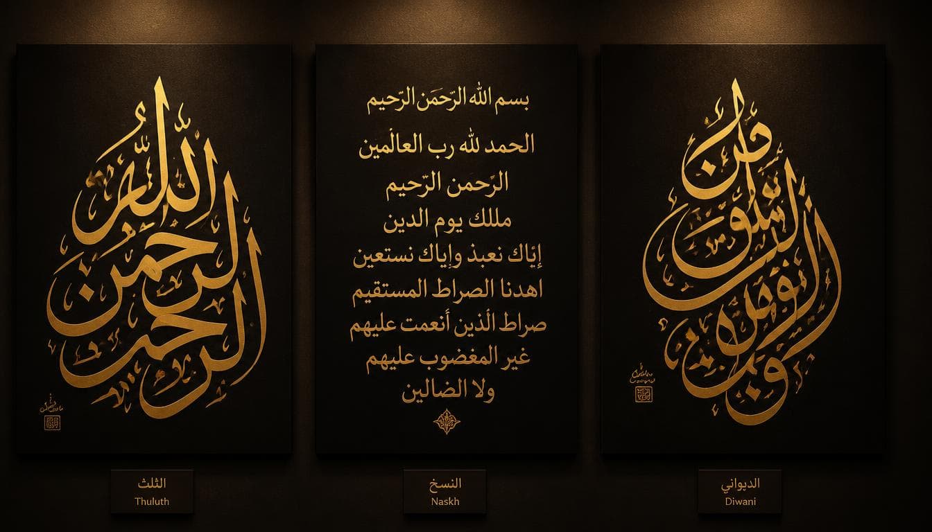
Thuluth — The Grand Statement
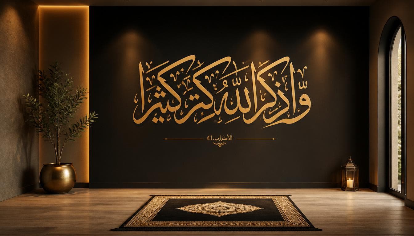
If calligraphy scripts were voices, Thuluth would be the deep, commanding tone that fills a cathedral. Developed in the 7th century and perfected over the following five hundred years, Thuluth is the most monumental of Arabic scripts. The letters are tall, structured, and deeply rooted in geometric proportion.
Every letter in Thuluth follows strict mathematical rules. The proportions are based on the rhombic dot — a diamond shape made by pressing the pen tip at a 45-degree angle. The height of an alif (the first letter of the Arabic alphabet) is measured in dots. The curve of a noon. The sweep of a seen. Everything is measured. Everything is intentional.
This is why Thuluth is the script you see carved into mosque walls, etched into the doors of the Kaaba, and written across the domes of the grandest Islamic architecture in the world. It demands space, commands attention, and carries an unmistakable sense of authority.
Best for: Large living room centrepieces, entrance hallways, formal dining rooms, prayer rooms. Verses that carry weight — Ayatul Kursi, Al-Fatiha, the Shahada.
Not ideal for: Small frames, minimalist interiors, or pieces where subtlety is more important than presence.
Naskh — The Quiet Companion
Where Thuluth announces, Naskh whispers. It is the script most Muslims read daily — it's the standard typeface of printed Qurans, newspapers, and books across the Arabic-speaking world. But don't mistake familiarity for simplicity.
Naskh is deceptively difficult to write well by hand. Its beauty lies in consistency — every letter must sit perfectly on the baseline, every curve must flow without hesitation, every dot must be placed with precision. There's nowhere to hide in Naskh. A single misplaced stroke is immediately visible because the reader's eye knows instinctively what this script should look like.
In calligraphy, Naskh is warm and approachable. It doesn't demand attention — it earns it quietly. A beautifully written Naskh piece feels like a conversation, not a lecture. It invites the viewer to read, to sit with the words, to absorb the meaning at their own pace.
Best for: Bedrooms, children's rooms, reading nooks, studies, personal prayer spaces. Longer passages where readability matters — full surahs, du'as, or collections of short verses.
Not ideal for: Making a dramatic visual statement from across a large room. Naskh is meant to be read up close, not admired from a distance.
Diwani — The Poetic Dance
If Thuluth is a cathedral and Naskh is a conversation, Diwani is a love poem written in the margins. Originally developed by Ottoman calligraphers for royal court correspondence, Diwani is the most ornate, flowing, and emotionally expressive of the three scripts.
The letters in Diwani connect and overlap in ways that other scripts don't allow. Words flow into each other like water — rising, falling, curling back on themselves in elegant sweeps. The dots and diacritical marks are often integrated into the composition as decorative elements rather than functional necessities.
Diwani is not easy to read for those unfamiliar with it. And that's part of its beauty. It prioritises emotion over legibility. The viewer doesn't need to read every word — they feel the movement, the rhythm, the grace of the composition before they understand the meaning. The art arrives before the language.
This is why Diwani is our most requested script for single words and short phrases — names, bismillah, masha'allah, subhanallah. When the text is short and the meaning is already known, Diwani transforms the words into pure visual poetry.
Best for: Personal gifts, custom name pieces, short prayers and phrases, romantic or intimate spaces. Wedding gifts, newborn name calligraphy, memorial pieces.
Not ideal for: Long Quranic passages where readability is important, or very large pieces where the intricacy of the script might be lost from a distance.
How to Decide
Forget about "which looks best" — they all look stunning when executed well. Instead, ask yourself three questions:
What do I want to feel when I walk into this room? If you want awe and protection — Thuluth. If you want warmth and contemplation — Naskh. If you want beauty and emotion — Diwani.
How large is the wall? Large feature walls call for Thuluth. Medium walls and grouped arrangements suit Naskh. Smaller, intimate spaces love Diwani.
Is the text long or short? Full surahs and long verses work best in Thuluth or Naskh. Single verses, names, and short phrases shine in Diwani.
Still Unsure?
Send us a message. Tell us the verse, the room, and the feeling you want — we'll recommend the script and create a free composition sketch before you commit. Every piece we make starts with a conversation, and there's never any pressure to decide immediately.
The right script will feel obvious when you see it. That's always how it works.